Ever landed on a website, thought about signing up, and then backed out because the form just felt like too much? Maybe it asked for too many details, looked confusing, or simply felt like a chore. We’ve all been there.
A high-converting lead capture form should be simple, clear, and quick to complete. If it takes too long or asks for unnecessary information, most visitors will leave without finishing it.

The key is to remove friction while still collecting the details you need.
So how do you do that? Keep reading for practical tips on creating a lead capture form that actually works.
What Is a Lead Capture Form?
A lead capture form is a short form on a website that collects visitor details like names, emails, and phone numbers. Businesses use these forms to turn website traffic into potential customers by gathering contact information for follow-ups, promotions, or sales.
Lead capture forms matter because 70% of website visitors leave without taking action. Without a way to collect their details, businesses miss out on valuable leads. A well-placed form helps keep potential customers engaged and increases conversions.
These forms are often found on landing pages, pop-ups, or signup sections, offering something in return, like a free guide, a discount, or exclusive content. The easier and more valuable the form feels, the more people will fill it out.
How to Create a High-Converting Lead Capture Form
If you want to create a high-converting form that collects quality leads and doesn’t get ignored, focus on making it clear, quick, and easy to complete. Here’s how to do that:
1. Write A Clear and Compelling Headline
Your headline is the first thing visitors read, so it needs to catch your visitor’s attention. If it doesn’t instantly explain the value, they will most likely skip it.
Think of it like a mini-pitch. You’re telling visitors what they’ll get and why it matters, all in one short sentence.
Instead of using generic words like “Sign Up” or “Register,” be specific and benefit-focused.
Here’s what works better:
- “Download Your Free Marketing Guide” — It is clear, direct, and offers something valuable.
- “Get 10% Off Your First Order” — It tells users what they’ll get right away.
- “Start Growing Your Leads in Minutes” — It promises quick results.
Good headlines do three things:
- Tell users what they’ll get.
- Make the value obvious.
- Use plain, everyday words.
You should avoid jargon or fillers, too. If your headline takes effort to understand, it’s not doing its job.
A strong headline can be the difference between a lead and a bounce, so you have to make it clear, quick, and worth clicking.
2. Keep Your Form Short and Relevant
People don’t want to fill out a long form. If it looks like it’ll take more than a few seconds, they’ll skip it.
The more fields you add, the fewer people will complete it. Start by asking yourself:
“What do I really need right now?”
If your goal is to stay in touch, you probably don’t need more than a name and email.
Here’s a quick guide for what to ask based on your form’s purpose:
- For newsletter sign-ups – Name and email are enough.
- For free download or lead magnet – Just an email usually works.
- For demo or consultation requests – Name, email, and company name help personalize outreach.
Only ask for more when it’s necessary. You can always collect more details later through follow-ups or during a sales conversation.
Fewer fields = less friction.
Keep your form clean, focused, and easy to complete. The simpler it looks, the more people will hit submit.
3. Include a Strong Call-to-Action (CTA)
The button on your form isn’t just a button—it’s your final pitch.
If it says “Submit,” you’re missing a chance to motivate action.
Instead, use a CTA that tells visitors what they’re getting and makes them feel ready to click. Think of it as the final step in your conversation with them.
Good CTAs are:
- Clear – They say exactly what happens next.
- Benefit-focused – They remind people what they’ll get.
- Actionable – They start with a strong verb.
Here are some better options than “Submit”:
- “Send Me the Free Guide”
- “Start My Free Trial”
- “Get Instant Access”
- “Book My Demo”
- “Get More Leads Now”
Also, make sure the button looks clickable. Use a bold color, plenty of white space around it, and don’t make people search for it.
A strong CTA builds confidence and helps close the gap between interest and action.
4. Make It Mobile-Friendly
Most people will see your form on their phone, not a desktop. If it’s hard to tap, read, or scroll, they’ll close it and move on.
Mobile traffic now makes up over 62% of global web visits. If your form doesn’t work well on smaller screens, you’re losing leads without even knowing it.
Here’s how to make your form easy to use on mobile phones:
- Use large buttons – Make sure they’re easy to tap with a thumb.
- Keep the layout clean – Avoid small text or cluttered fields.
- Limit the number of fields – Less typing = more completions.
- Avoid tricky pop-ups – If a form pops up and can’t be closed easily, people will just leave.
Test your form on both a phone and a tablet. Try filling it out yourself. If it feels like a hassle, it probably is.
The easier it is to fill out on mobile, the more likely people will finish it.
5. Place Forms Where People Can See Them
Even the best form won’t work if no one sees it. Placement matters.
You want your form to be in a spot that’s easy to find without being annoying or in the way.
Here are a few smart places to put your form:
- Above the fold – This means it’s visible right when someone lands on your page, no scrolling needed.
- On a dedicated landing page – Useful for ads, campaigns, or lead magnets where your only goal is sign-ups.
- As an exit-intent pop-up – This shows up when someone is about to leave the page, giving you one last chance to capture their info.
Where you place the form depends on your goal, but the rule is the same: Don’t make people hunt for it.
Also, avoid crowding your form with too much text or other distractions. Keep it focused, clean, and easy to complete.
If your form is easy to find and quick to fill out, more people will use it.
6. Add Interactive Elements and Images
Forms don’t have to be plain boxes with blank fields. A few small touches can make them feel more inviting and easier to use.
Adding images or interactive elements helps catch attention and keep visitors engaged.
Here’s what you can try:
- Show a quick preview of what they’ll get — Like the cover of a free guide or a sample screenshot of your product.
- Use checkboxes or sliders — These make the form feel more like a quick interaction instead of a task.
- Group-related fields — Use spacing and simple visuals to guide people through the form without confusion.
These details may seem small, but they change how the form feels. Instead of feeling like work, it becomes something users can complete quickly and comfortably.
You don’t need fancy animations or over-the-top design. Just a few thoughtful touches can make a big difference.
When forms look friendly and easy, people are more likely to fill them out.
7. Add Trust Signals
Most people think twice before giving out their personal info online—and that’s fair. If your form looks even a little sketchy, they’ll walk away.
Adding simple trust signals helps visitors feel safe and confident about signing up.
Here are a few easy ways to build trust:
- Privacy statements – A short note like “We never send spam” or “We’ll only email you about what you signed up for” shows respect for their inbox.
- Social proof – Mention how many people have already signed up or include a quick quote from a happy user. Even one line can make a difference.
- Security icons – Badges like “Secure checkout” or “GDPR compliant” are small but effective in building confidence.
It’s not about adding too much text—it’s about making people feel like they’re in good hands.
If visitors trust you, they’re more likely to complete the form. Even a single line under the CTA can make a big impact.
Build trust, and more leads will follow.
8. Ensure Forms Are Secure
No one wants to share their contact info if the form looks unsafe. Even if your site is secure, visitors need to see signs that their data is protected.
A secure form builds confidence and encourages people to complete it.
Here’s how to show your form is safe:
- Use HTTPS – This adds a padlock icon in the browser bar. It’s a small detail, but people notice.
- Display security badges or labels – If your form is GDPR-compliant or you use a trusted third-party tool, say so.
- Keep the design clean and professional – Outdated layouts or broken links can make users think twice, even if the form works fine.
Also, don’t ask for sensitive information unless it’s necessary. If you’re only collecting names and emails, keep it simple and easy.
Visitors are more likely to fill out a form when they know their data is in good hands.
9. Send Automated Follow-up Emails
Once someone fills out your form, don’t leave them hanging. That first follow-up matters.
An automated email is a simple way to keep the conversation going. It shows that you’re organized, responsive, and ready to help.
Here’s what your follow-up email should include:
- A thank you – Let them know you appreciate their time.
- What they signed up for – This could be a guide, a discount, or a confirmation of a demo.
- What happens next – Give clear next steps, like scheduling a call or checking their inbox for a download link.
Even a short, friendly message goes a long way. It helps you stay top-of-mind and sets the tone for a good experience.
Follow-ups turn form fills into real conversations and real opportunities.
10. Test and Optimize Regularly
Even if your form is working okay, it can always work better. Small changes can lead to big results—you just need to test what works.
Start by running simple A/B tests. That means trying two different versions of something to see which one gets more sign-ups.
Here’s what you can test:
- Headlines – Try different wording to see which one grabs more attention.
- CTA buttons – Test text like “Get the Guide” vs. “Start Now.”
- Form length – Remove a field and check if completion rates go up.
- Placement – Compare results from a landing page vs. a pop-up.
Make one change at a time so you know what’s actually driving the improvement.
Also, track how leads behave after submitting the form. Are they opening your follow-up emails? Are they converting into real opportunities? These signals help you fine-tune both your form and your follow-up strategy.
The key is to keep improving. What works today might stop working as your audience or offer changes. Regular testing keeps your form effective and your lead pipeline strong.
Lead Capture Form Samples to Help You Get Started
Not sure what type of form to use? Here’s a list of common lead capture form formats you can build based on your goals.
Contact Forms
A contact form is the go-to option when someone wants to reach out with a question, comment, or request.
You’ll find these on most websites, usually on a “Contact Us” page. They’re great if you want to let people get in touch without sharing your email address.
What to include:
- Name
- A short message box
Sample:

Source: Neilpatel.com
Multi-Step Forms
Some forms need more than just a name and email—and that’s okay. A multi-step form breaks things down into smaller, less overwhelming parts.
This is a good choice when you’re qualifying leads or asking more detailed questions like for a trial, a custom quote, or onboarding new users.
How it’s structured:
- Step 1: Ask for basics (name, email)
- Step 2: Add a few business details (company name, size)
- Step 3: Ask any key preferences or goals
Sample:

Source: Salesforce.com
Demo Request Forms
When someone fills this out, they’re ready to see what you offer. These are warm leads—don’t scare them off with a long or confusing form.
You’ll usually place this form on your product page or pricing page. It’s also great in email campaigns for people who already know a bit about your product.
What to include:
- Name
- Work email
- Company name
- Team size
- Phone number
- Job title (optional)
Sample:

Source: Hubstaff.com
Newsletter Sign-Up Forms
These forms are all about staying in touch. They’re short, simple, and a great way to build your email list over time.
You’ll often see these in blog sidebars, website footers, or as small pop-ups. They’re perfect if you send tips, updates, or helpful content on a regular basis.
What to include:
- First name (optional)
- Email address
Sample:

Source: Zoho.com
Free Trial Forms
If you offer a product people can try on their own, this is the form that gets them in the door. The goal here is speed—get them started without asking for too much.
Add this form to your homepage, pricing page, or product section. You want it visible to users who are ready to try things out for themselves.
What to include:
- Name
- Company name
- Phone number
Sample:

Source: Freshworks.com
Pop-Up Forms
These are forms that appear while someone is browsing your site. They’re often used to capture attention and grab leads while interest is still high.
Try adding a pop-up after someone scrolls halfway down the page, spends a few seconds on your blog, or is about to leave the site.
What to include:
- Email (main field)
- First name (optional)
Sample:

Source: HubSpot.com
Making Lead Capture More Effective With LeadAngel
Creating a great form is just the first step. What really moves the needle is what happens after someone fills it out.
If leads sit unassigned, get lost in a spreadsheet, or bounce between reps, you’re not just losing time, but also you’re losing opportunities.
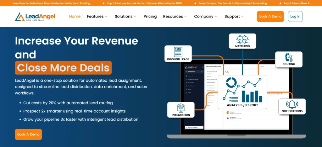
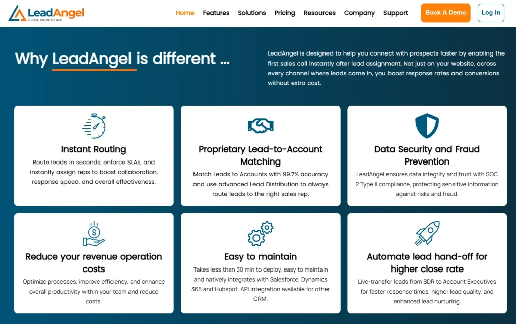
LeadAngel helps B2B teams capture, qualify, and route leads at scale. It turns every form submission into a ready-to-work lead by handling the manual tasks most teams struggle to keep up with.
And it works as a complementary layer to your existing CRM, giving you more control without changing your current setup.
Key Features
Here’s how it turns form submissions into fully qualified, sales-ready leads:
Lead-to-Account Matching That Keeps Your CRM Clean
Every new lead is automatically checked against existing accounts. No duplicates, no confusion. If a match is found, it’s flagged and updated—if not, it’s logged as a new opportunity. Your sales team always knows exactly who they’re talking to.
Advanced Lead Routing Based on Your Business Rules
Whether you use territory assignment, round robin, or a named account model, LeadAngel gives you complete control. Build routing rules by region, job title, product interest, or any custom form fields, and let the system handle the rest.
Intelligent SDR-to-AE Handoffs
Make sure qualified leads don’t get stuck in limbo. LeadAngel supports multi-stage routing, so leads move smoothly from SDRs to AEs with full visibility and ownership tracking.
Automated Scheduling and Follow-Ups
Trigger instant emails, meeting invites, or rep notifications the moment a form is submitted. LeadAngel eliminates delays and keeps your team moving fast.
Built-In Deduplication and Data Cleanup
Bad data leads to missed revenue. LeadAngel automatically identifies and merges duplicates across leads, contacts, and accounts, keeping your CRM clean and reliable.
Full Transparency With Routing Logs and Audit Trails
See exactly when and where each lead was routed—and who owns it now. Detailed routing logs give your team insight into performance, gaps, and opportunities for improvement.
Scalable Infrastructure That Grows With Your Pipeline
Whether you’re routing 1,000 leads or managing 500,000 records, LeadAngel is built to handle it. No slowdowns, no breakdowns—just smooth operations at any scale.
The result? More speed, less guesswork, better leads.
Pricing Plans
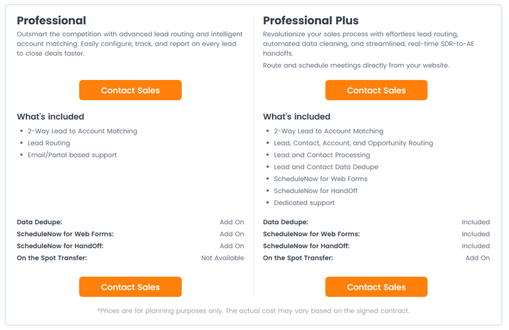
- Professional Plan – Supports 100,000 lead records, 10 salespeople, lead-to-account matching, lead routing, and email support. Optional add-ons include data deduplication and scheduling.
- Professional Plus Plan –Supports 500,000 lead records, 25 salespeople, advanced routing, built-in data deduplication, scheduling tools, and dedicated support. Extra features like on-the-spot transfers are available.
When your form is powered by LeadAngel, every new submission is already one step closer to revenue. Sign up for free or book a demo with LeadAngel today!
Upgrade Your Lead Capture Strategy With LeadAngel!
A high-converting lead capture form doesn’t have to be complicated. When it’s easy to find, quick to fill out, and followed by the right next steps, it can make a real difference in how many leads you generate and how fast you turn them into customers.
But the form is just the beginning.
To truly make the most of every lead, you need a system that keeps things moving after submission. That’s where LeadAngel fits in.
From smart lead-to-account matching to real-time routing and automated follow-ups, LeadAngel helps you go beyond basic lead capture and build a process that’s faster, cleaner, and more reliable.
Want to see it in action? Sign up for free or book a demo with LeadAngel today!
See How LeadAngel Can Transform Your Lead Management
Curious to experience the power of LeadAngel firsthand? We understand!
We're offering a complimentary trial so you can explore LeadAngel's features at your own pace. Once you request a free trial, we'll schedule a personalized onboarding session to ensure you maximize the value of LeadAngel.
Ready to take your lead management strategy to the next level? Request your LeadAngel trial today!
In addition to exploring the platform, we recommend visiting our LeadAngel Help Center for in-depth guidance. Our dedicated customer support team is also available to answer any questions you may have at sales@leadangel.com.
FAQs
The lead capture process starts when someone visits your website, ad, or landing page. If they’re interested in what you offer, they fill out a form to get more information, like a free guide or a demo. After they submit their details, the next step is following up quickly either by email, call, or a sales rep reaching out. The goal is to turn that lead into a customer before they lose interest.
Lead capture forms on Wix are built-in tools that help websites generate leads. Wix offers customizable lead gen form options that let businesses ask for the details they need. These lead forms can be placed on lead generation pages, pop-ups, or contact pages. Wix also lets users connect their forms to email marketing tools and CRMs, so leads are stored and easy to manage.
The best lead generation forms are short, clear, and mobile-friendly. They only ask for the most important details so people don’t feel overwhelmed. Tools like HubSpot Forms, Jotform, and Typeform are great for creating easy-to-use forms. If you want your lead gen form to do more than just capture leads, LeadAngel helps by managing and routing leads so they get to the right person fast.
A lead capture landing page is a focused webpage designed to collect contact info through a short form and clear offer like a free guide or demo. Unlike regular pages, it’s built to drive one action: form submissions. These pages are often used in ads or campaigns to turn traffic into leads.
Lead capture software lets businesses collect contact details through forms on pages, pop-ups, or widgets. Tools like HubSpot Forms, Jotform, and Typeform help build and store form responses. But if you need to do more than just collect leads, you’ll want a lead management solution like LeadAngel. It works alongside your forms to route leads to the right reps, match them to existing accounts, and qualify them automatically.